Are you wondering what colors are currently trending for home decor? Staying up-to-date with the latest color trends is essential for creating a stylish and modern living space. From nature-inspired tones to bold and vibrant hues, the world of home decor is constantly evolving. In this article, we’ll explore the top color trends that are shaping the design landscape, offering inspiration and insight for those looking to refresh their homes.
As we delve into the influence of Pantone’s Color of the Year and the resurgence of pastel palettes, it becomes clear that color plays a crucial role in setting the tone and ambiance of a space. Whether you’re considering a complete home makeover or simply looking to add a pop of color, understanding current trends can help you make informed decisions about your decor choices.
The use of earthy and natural colors like olive green, terracotta, and sandy beige has gained momentum in recent years. Additionally, bold and vibrant colors such as electric blue, fuchsia, and mustard yellow are making a statement as accent hues in home decor.
The enduring appeal of neutral colors like white, gray, and taupe also remains steadfast in interior design. Join us as we explore these exciting color trends and provide tips on how to effectively mix and match different color schemes to create a visually appealing home decor.
The Influence of Pantone
Pantone’s Color of the Year has a significant impact on home decor trends, influencing everything from paint colors to furniture and accessories. Each year, the global color authority selects a shade that reflects current cultural and design trends, setting the tone for the upcoming year. The chosen color often makes its way into fashion, graphic design, and interior decorating, creating a ripple effect across various industries.
Pantone’s Color of the Year for 2021 is “Ultimate Gray” and “Illuminating,” a combination of a calming neutral gray and a bright, cheerful yellow. This pairing represents resilience and hope, making it an ideal choice for home decor in light of current global challenges. As a result, these colors have been widely incorporated into interior design schemes, from wall paint to soft furnishings.
When it comes to implementing Pantone’s Color of the Year into your home decor, there are numerous ways to do so effectively. Consider incorporating accents in “Ultimate Gray” and “Illuminating” through items such as throw pillows, rugs, curtains or decorative objects. These pops of color can instantly rejuvenate a space without having to make major changes in your existing decor.
- Consider painting an accent wall in “Ultimate Gray” to create a focal point in any room.
- Add pops of “Illuminating” through small decorative elements such as vases, candles or artwork.
- Introduce these colors through textiles like throw blankets or accent cushions for an easy refresh.
With Pantone’s Color of the Year having such an influential role in defining home decor trends each year, it’s important for homeowners and interior designers alike to take note of its impact when considering new color palettes for their living spaces. By staying informed about these influential color choices, you can ensure that your home remains stylish and up-to-date with current design trends.
Nature-Inspired Tones
Olive green, in particular, has gained prominence in home decor due to its versatility. It can be used as both a neutral base color or as a statement hue, depending on how it is incorporated into the overall design scheme.
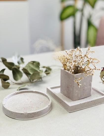
Terracotta, on the other hand, adds warmth and depth to any space, making it an ideal choice for creating an inviting ambiance. Sandy beige serves as a great neutral backdrop for other bolder tones or as a standalone color that exudes tranquility.
Research has shown that nature-inspired tones can positively impact mental well-being by evoking feelings of serenity and connectedness to the environment. By bringing these earthy colors into their homes, individuals can create a more harmonious living space that promotes relaxation and comfort.
| Earth Tones | Attributes |
|---|---|
| Olive Green | Versatile and calming |
| Terracotta | Warmth and depth |
| Sandy Beige | Neutral backdrop for other hues |
Bold and Vibrant Hues
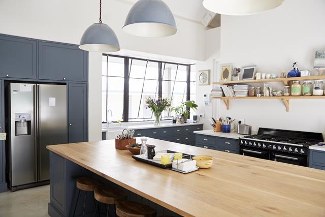
In recent years, there has been a noticeable shift towards using bold and vibrant colors in home decor. This trend has brought a sense of energy and personality into interior design, challenging the traditional notion that muted tones are the safest choice for decorating. Electrifying shades like electric blue, fuchsia, and mustard yellow have become popular choices as accent colors in many modern homes.
Here are some ways to effectively incorporate bold and vibrant hues into your home decor:
- Accent Walls: Painting one wall in a bold color can serve as a focal point in a room without overwhelming the entire space.
- Statement Furniture: Introducing a piece of furniture in an eye-catching color can add visual interest to any room.
- Artwork and Accessories: Incorporating colorful artwork or accessories like throw pillows, rugs, or curtains can infuse vibrancy into a neutral space.
It’s important to remember that balance is key when using bold colors in home decor. Pairing these hues with more subdued tones can help create harmony in a room while allowing the vibrant colors to shine. Additionally, experimenting with different color combinations can yield unexpected but delightful results that reflect your personal style.
Ultimately, the trend of incorporating bold and vibrant colors into home decor presents an opportunity for homeowners to add excitement and flair to their living spaces. By embracing these lively hues, individuals can create interiors that are both visually stimulating and reflective of their unique tastes.
The Timelessness of Neutrals
Neutrals have always been a staple in home decor, and their enduring appeal continues to make them a popular choice for interior design. Whether it’s the crisp cleanliness of white, the sophisticated elegance of gray, or the warm versatility of taupe, neutral colors have a timeless quality that can effortlessly complement any style or trend.
Classic White
White has long been synonymous with simplicity and purity, making it a go-to color for creating a clean and airy aesthetic in home decor. From walls and furniture to accessories and textiles, white is versatile enough to serve as a backdrop for other accent colors while also being striking enough to stand on its own.
Elegant Gray
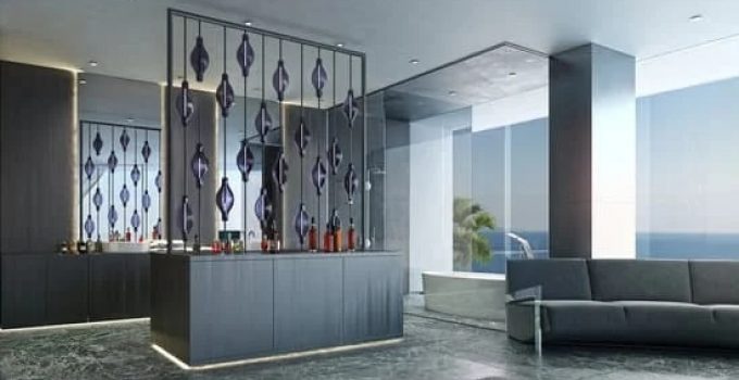
Gray has become increasingly popular in recent years as a modern alternative to traditional neutral tones. Its cool undertones create a sense of calm and sophistication, making it an ideal choice for creating a contemporary and stylish atmosphere in any room.
Versatile Taupe
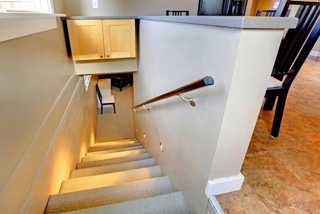
Taupe is the perfect middle ground between warm brown and cool gray, making it an incredibly versatile neutral option for home decor. Its subtle warmth adds depth and richness to any space while still maintaining a sense of neutrality that allows for easy coordination with other colors and textures.
Overall, neutral colors like white, gray, and taupe continue to be timeless choices for home decor due to their ability to adapt to changing trends while maintaining their classic appeal. Whether used as the main color scheme or as supporting elements within a design, neutrals offer endless possibilities for creating a harmonious and inviting living space.
Pastel Palette
The resurgence of pastel colors in modern home decor has brought a sense of lightness, serenity, and playfulness to interior design. Powder blue, blush pink, and mint green are just a few examples of the soothing and delicate colors that have made a comeback in the world of home decor.
These soft hues evoke a sense of nostalgia while also adding a contemporary twist to any living space. They are versatile enough to be used as the main color scheme or as accent colors in furniture, upholstery, and accessories.
In today’s fast-paced world, pastel colors provide a much-needed respite from the chaos, offering an atmosphere of calmness and tranquility within our homes. Powder blue is often associated with serenity and peace, making it an ideal color choice for bedrooms and living rooms. Blush pink has become increasingly popular for its ability to infuse warmth and charm into any space, while mint green adds a refreshing and rejuvenating touch to interior design.
Interior designers are embracing these pastel hues not only because they are visually appealing but also because they can create a sense of airiness and spaciousness in smaller rooms. When combined with natural materials like wood, rattan, and linen, pastel colors can bring a sense of harmony and balance to any room.
Whether it is through wall paint, furniture upholstery, or decorative accents such as vases or throw pillows, incorporating powder blue, blush pink, and mint green into your home decor can breathe new life into your living spaces.
| Pastel Color | Description |
|---|---|
| Powder Blue | Associated with serenity and peace; ideal for bedrooms and living rooms. |
| Blush Pink | Infuses warmth and charm into any space; increasingly popular for interior design. |
| Mint Green | Adds a refreshing and rejuvenating touch to interior design; creates harmony when combined with natural materials. |
Mixing and Matching
Consider the 60-30-10 Rule
One popular and effective way to mix and match colors in home decor is by following the 60-30-10 rule. This rule suggests that 60% of the room should be a dominant color, 30% should be a secondary color, and 10% should be an accent color.
For example, if you have a neutral wall color as your dominant color (60%), you can use a complementing or contrasting secondary color for your furniture, drapery, or rugs (30%), and then incorporate pops of an accent color (10%) through decorative accessories like throw pillows, vases, or artwork.
Use a Color Wheel for Harmonious Combos
Utilizing a color wheel can help you identify harmonious combinations when mixing and matching colors. Analogous colors (those next to each other on the color wheel) create a calm and serene feeling when used together. On the other hand, complementary colors (opposite each other on the color wheel) provide high contrast and visual interest.
Consider the Mood You Want to Create
When mixing and matching colors for home decor, consider the mood or atmosphere you want to evoke in each room. For a tranquil and relaxing ambiance, opt for cool tones like blues and greens. To create an energetic and vibrant space, incorporate warmer hues such as reds or yellows. Understanding the emotional impact of different colors can help you achieve your desired atmosphere in each area of your home.
By keeping these tips in mind, you can skillfully mix and match different color schemes to create a cohesive and visually appealing home decor that reflects your personal style while staying on-trend with current color preferences.
Unique Color Combinations
In conclusion, the world of home decor is constantly evolving, and staying up-to-date with the latest color trends is essential for creating a modern and stylish living space. The influence of Pantone’s Color of the Year cannot be understated, as it sets the tone for the color trends that will dominate home decor for the year.
Nature-inspired tones like olive green, terracotta, and sandy beige continue to gain popularity for their calming and earthy feel, while bold and vibrant hues such as electric blue, fuchsia, and mustard yellow are being used as accent colors to add a pop of excitement to interiors.
Neutrals like white, gray, and taupe remain timeless choices for home decor, providing a versatile backdrop for any style or design aesthetic. Additionally, pastel colors have made a resurgence in modern home decor, adding a soft and delicate touch to interiors.
Mixing and matching different color schemes can create a cohesive and visually appealing look in home decor while unique color combinations like navy and mustard or emerald green and coral are gaining traction for those looking to make a bold statement with their interior design.
Ultimately, choosing the right colors for your home decor is a personal decision that should reflect your individual style and personality. Whether you prefer the soothing tones of nature-inspired colors or the boldness of vibrant hues, there are endless possibilities for creating a personalized and inviting living space based on the trending colors in home decor.
By staying informed about these color trends and experimenting with different combinations, you can transform your home into a stylish sanctuary that reflects the current aesthetic preferences while also staying true to your own unique vision.
Frequently Asked Questions
What Is the Trend in Interior Color for 2024?
The trend in interior color for 2024 is leaning towards soothing and calming tones. Shades of green, blue, and earthy neutrals are expected to be popular choices for interior spaces. These colors are associated with tranquility, nature, and mindfulness, reflecting the growing importance of mental well-being in home design.
The trend also includes incorporating pops of warm, comforting hues to add dimension and coziness to the overall color scheme. Overall, the emphasis is on creating peaceful and harmonious environments within the home.
Hello, lovely readers! I’m Sheila Collins, and I’m delighted to be your trusted guide on this exciting journey of home improvement, design, and lifestyle. As the founder and editor-in-chief of Home Guide Blog, I’m passionate about all things related to homes, and I’m here to share my knowledge, experiences, and insights with you.

